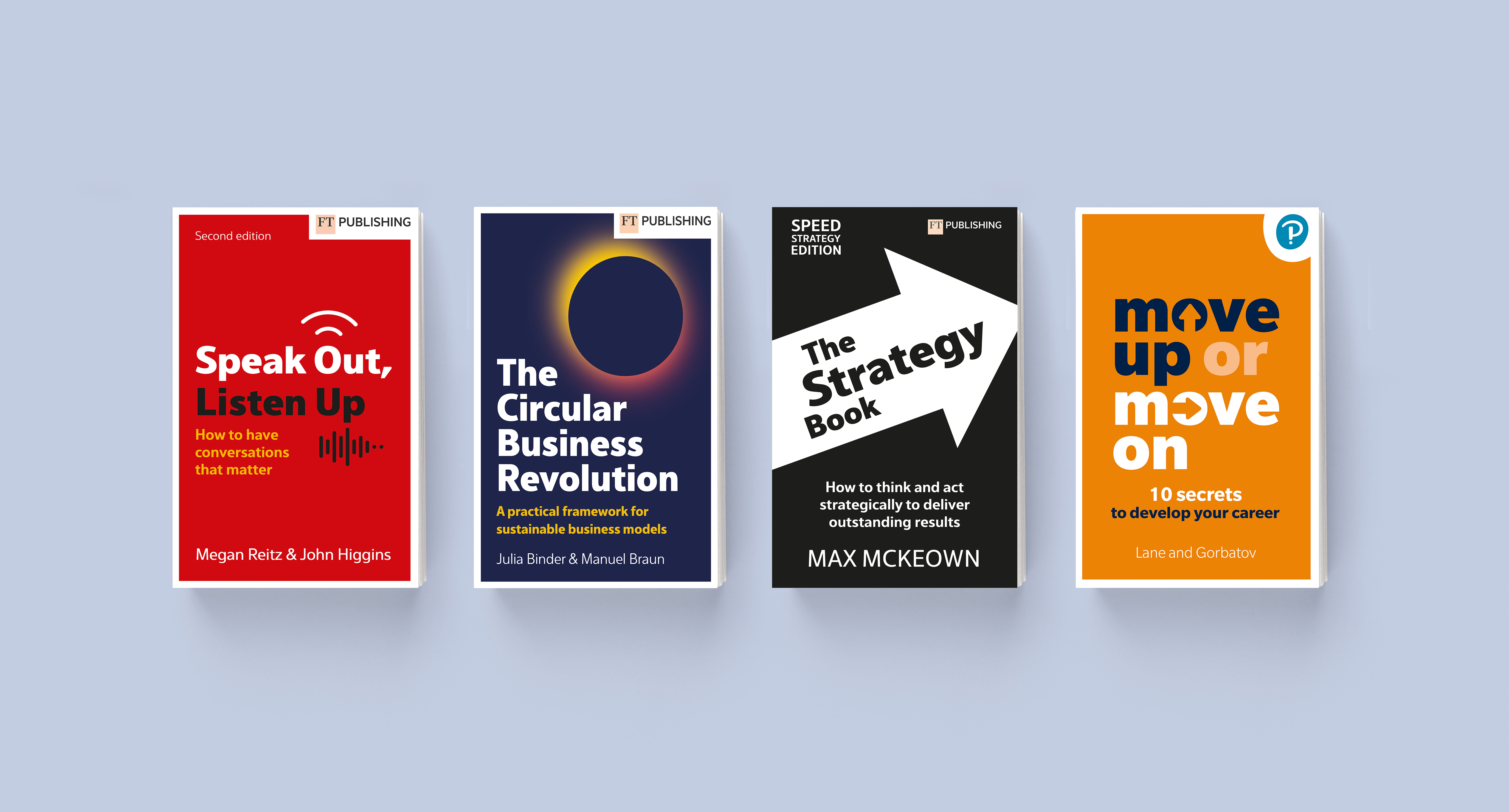
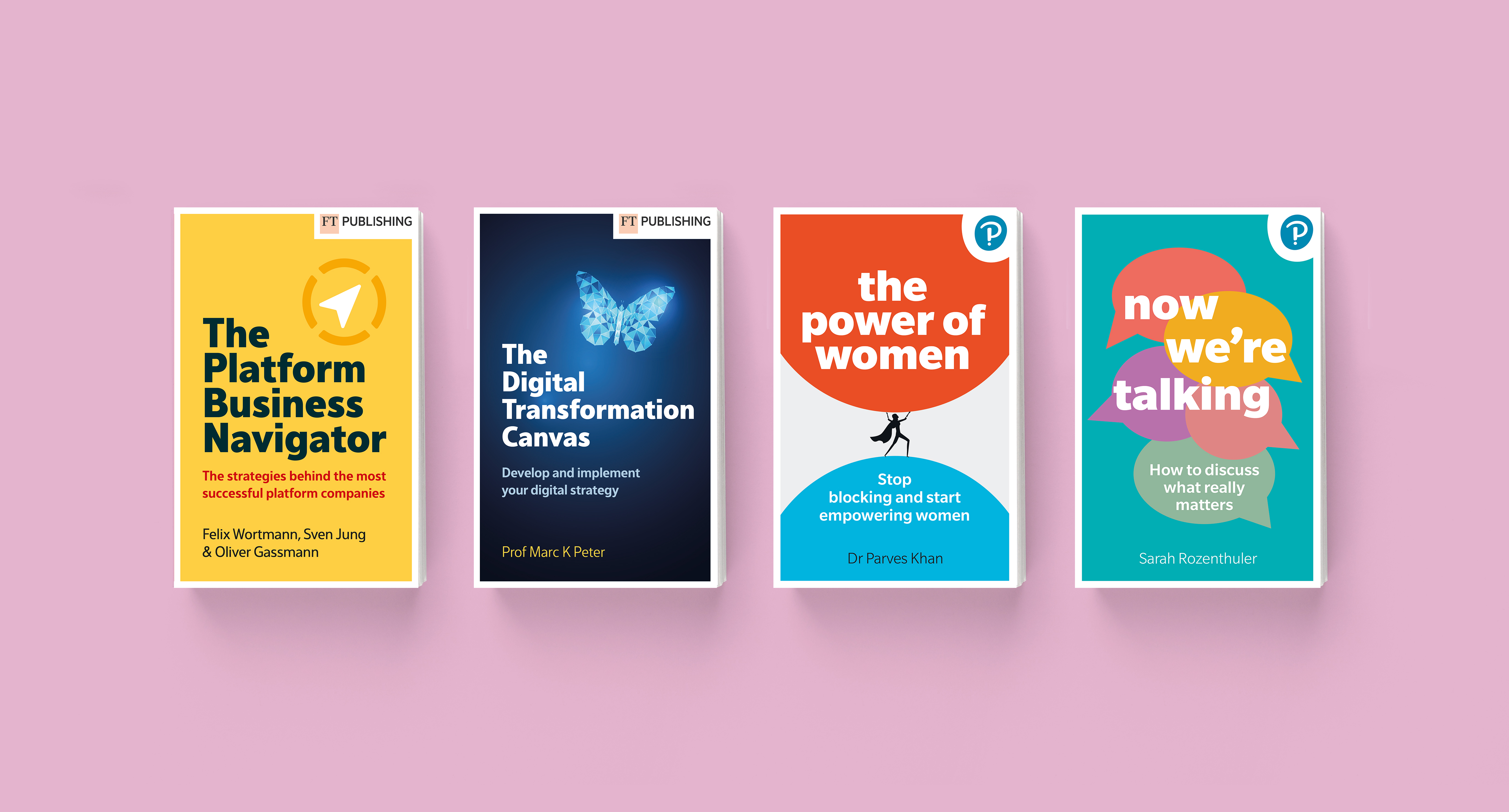
Rebranding for Pearson and FT Publishing jackets

Graphic Design
January 2024
Project Overview
The client had been reflecting on their jacket designs at Pearson and how they could make them feel a bit more like they are from the same publisher.
This most recently came to light when WHSmith wanted to highlight a shelf of six Pearson books but they lacked cohesiveness. They didn't want everything to look the same, but wanted them to be harmonious.
The solution
The first objective was to create various design templates using the both the Pearson and FT Publishing logos so the client could see how the positioning might work for both brands. we also created a colour palette for each.  
Once this was achieved we chose a family typeface with various weights that could be used for headings, subtitles and body copy.
Finally, to see this in action, we received the six of book briefs to start the creative process for the cover concepts.
Four book designs
Pearson is an amazing publisher and both well respected in the industry with a highly skilled team. From us they needed an equally ambition, creativity and a flexible agency.
The project brought with it a huge amount of responsibility. We needed to understand their brand and what was required, so they had the confidence to present the results, both to the authors and their partner, WHSmith.
We’ve been really proud to be their partner of choice and keep delivering top results and work with the very best in the field.
What we’re most proud of
Four book jacket designs

We are just one click away!
Find out what we can do for you.

We are ready to talk about your amazing project.
Call Nick or Sophie on +44 (0)7413 319414 or +33 (0)6 63 53 26 46

Thank you! Your submission has been received!
Oops! Something went wrong while submitting the form.